Nobody designed retro cassette design on purpose. That’s the part everyone doing it wrong keeps missing. The little plastic clamshell that’s suddenly on every third t-shirt and tote bag wasn’t a mood board — it was a manufacturing constraint that happened to look perfect for forty years, then happened to look perfect again the second Gen X started buying our own nostalgia back. We didn’t fall for the look. We grew up inside it.
So here’s the thing worth saying slowly, because most of what’s out there about this topic is a stock-photo grid or a Pinterest board with no opinions in it at all: the reason the cassette still reads as correct forty years later isn’t nostalgia. It’s that the object was engineered to do one job, did it with zero ornament, and every design element you’re now seeing recycled onto merch was originally there because leaving it off would’ve broken the tape. Understand that, and you understand why so much of the “retro” stuff being sold right now feels hollow. It copied the shape and skipped the reason.
The clamshell wasn’t designed. It just happened.
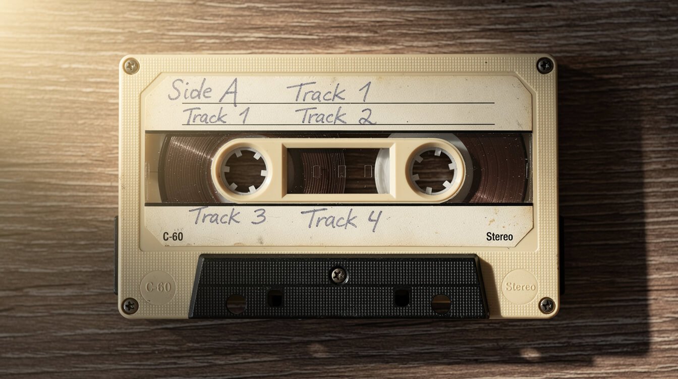
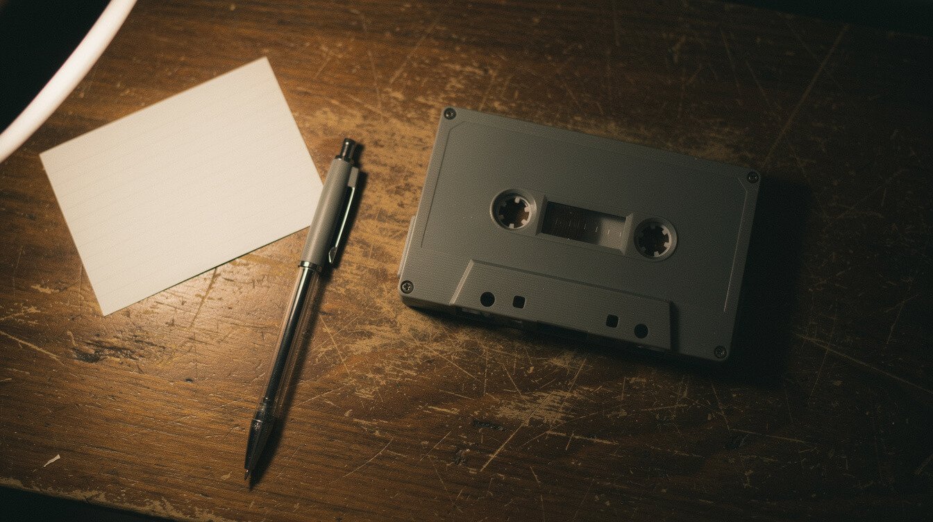
Pop one open sometime — an old one, the kind with the two Phillips-head screws instead of the snap-together kind that came later and always cracked at the hinge. Inside is not a design statement. It’s a small machine wearing the minimum housing required to keep it alive: two spindles, a felt pressure pad, a spring, a length of leader tape wound so tight it hums when you pull it. Every panel of clear plastic exists because someone needed to see the tape was still moving without opening the case. Every rounded corner exists because a square one would’ve split in a jacket pocket. Nothing on that shell is there to look cool. It’s there because the alternative was a $6 piece of technology that jammed.
That’s the accidental genius people are chasing when they slap a cassette graphic on a mug and call it a vibe. The proportions feel right to your hand because they were sized to a spool of tape, not to a screen or a trend cycle. Compare that to almost anything designed on purpose to look retro today — it’s always slightly too big, too glossy, too aware of itself. The real object never had that problem. It didn’t know it was going to be an aesthetic. It just had a job.
Same story with the size. A cassette fits a jacket pocket, a jean pocket if you didn’t mind the corner digging into your leg, a shoebox under the bed with room for forty of its closest friends. That wasn’t a lifestyle choice some brand strategist made about “portability.” It was the smallest box that would still hold a working spool without the tape spilling out. And because it happened to be pocket-sized, it accidentally invented an entire portable culture — trading tapes at lunch, dubbing a friend’s copy in real time on a double deck, building a stack for a car ride — that no one designed on purpose either. The object created the behavior. The behavior is what people are actually nostalgic for. The plastic is just the part you can put on a shirt.
Function first, always
This is the part a good retro cassette design actually has to reckon with: form followed function so completely that the function became the form. You can’t fake that after the fact by adding “distressed” texture to a vector file. Either the thing you’re making solved a real problem with the smallest possible shape, or it’s cosplay. Most of what’s for sale right now is cosplay. We notice. That’s not a brag, it’s just what happens when the whole generation grew up holding the real thing.
The label was the whole project
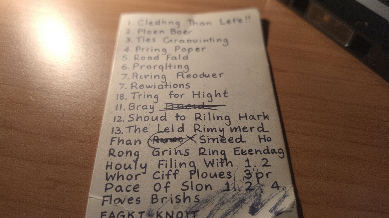
Before there was a graphic designer’s idea of “cassette aesthetic,” there was you, at a kitchen table, with a ballpoint pen that was almost out of ink, trying to fit “SIDE B — DO NOT SKIP TRACK 4, IT’S THE GOOD PART” into a paper rectangle the size of a stamp. The little card that slides into the case J-card, if you want the actual name for it wasn’t packaging. It was the last honest handwriting sample most of us ever left behind before everything went typed.
Look at an old one now and you can read a whole afternoon in it: the track list started confident, got smaller and more cramped by song six because you ran out of room, and there’s a name crossed out where you changed your mind about who the tape was for. Nobody was designing an aesthetic. Everybody was just trying to make something fit. And it’s exactly that constraint — small card, tiny lines, real handwriting under real pressure — that gives the object its whole personality. A printed shirt with a fake cassette label on it is trying to buy that personality wholesale. It can’t. The personality was never in the shape of the card. It was in the fact that a specific, slightly nervous person filled it out by hand at 11pm.
The label wasn’t decoration. It was proof somebody sat there and chose, in order, the exact songs they wanted you to hear next.
That’s worth remembering the next time you’re deciding whether a piece of retro cassette design is doing something real or just doing a font. If it can’t explain the smudge, it doesn’t understand the object.
We’ve written before about the actual mechanics of building one of these things — the running order, the timing, the way a good tape argues with itself between songs three and four. If you want the deeper dive into the ritual itself rather than just the object it lived in, that’s the rules nobody wrote down for making a mixtape. This piece is about the shell. That one’s about what went inside it.
Why the beige-and-black palette never needed an update
Every few years some corner of the internet “rediscovers” the chunky beige-and-black look — thick bezels, blocky lettering, a little red LED for texture — and treats it like a bold new design language. It has a name now, if you go looking (the aesthetics wikis file it under something like “cassette futurism”), and there’s a whole minor industry of moodboards built around it. Which is funny, because it was never a language. It was just what plastic and consumer electronics looked like before anyone thought “personal tech” needed to look expensive.
Here’s why it still works: those colors and shapes weren’t chosen to communicate anything. Beige hid dust and didn’t yellow as fast as white. Black hid fingerprints on the buttons you actually touched. The blocky sans-serif on the controls was legible from arm’s length in a dim room, which mattered when the only light was a nightstand lamp and a clock radio. Every choice was practical first. And practical, done with zero self-consciousness, ages better than anything that was trying to be stylish. Stylish always dates. Honest doesn’t.
That’s the trap in a lot of “retro” merch right now — it imports the palette but adds the self-consciousness back in. A perfectly distressed gradient. An artificially “worn” texture that’s actually crisp and new. The second a design starts winking at you about how retro it is, it stops being retro and starts being a costume. The real thing never winked. It just sat there being beige.
Compare it to the equipment that shared a shelf with the cassette deck growing up — the boombox with its two mismatched speaker grilles and a handle it did not need to have but somehow always looked right carrying. Same rules applied there: nothing chrome, nothing curved just to be curved, every button sized for a thumb in a hurry. That’s not a “look.” That’s what happens when engineers, not marketers, get the final say on what a product is allowed to be.
The clock radio on the nightstand followed the same code. The car stereo faceplate did too, right down to the eject button that fired the cassette out like it had somewhere to be. None of these objects were in conversation with each other about “brand consistency.” They just all got built by people solving the same kind of problem — how do you make a thing legible, durable, and cheap to mold — and the family resemblance that resulted is the actual palette everyone’s now trying to bottle. You can’t shortcut your way to that resemblance with a color picker. It only shows up when the constraints are real.
What a cassette case teaches you about restraint
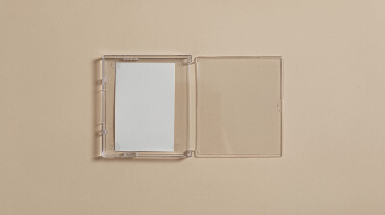
Take the case apart, or just really look at one, and count the decisions that weren’t made. No extra color. No mascot. No tagline. A window, a spine label, a hinge, and whatever you wrote on the inlay card. That’s it. In a world currently drowning in packaging that screams for attention on a shelf it’ll sit on for four seconds, there’s something almost radical about an object that assumed you already wanted it and didn’t need to convince you of anything.
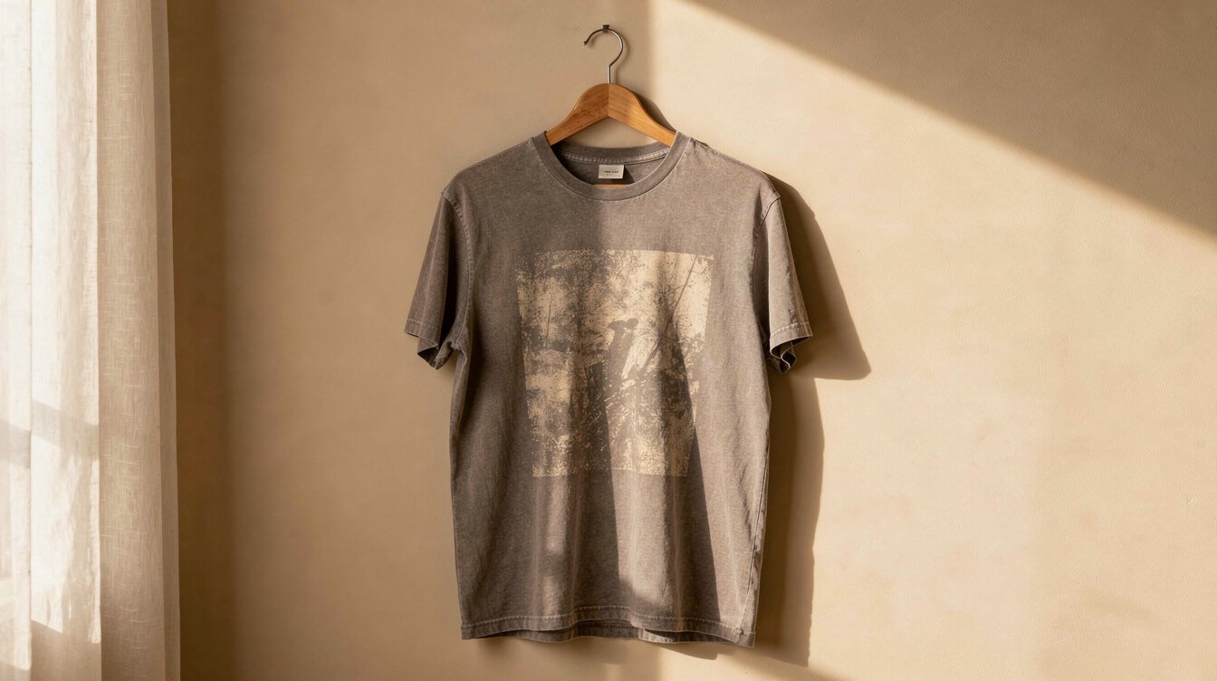
That restraint is the actual design lesson, and it’s the one we build every product around here to respect. It’s also, not coincidentally, the whole reason a good retro cassette design shirt works better as a small, precise detail than as a giant chest-print cassette clip-art doing all the talking. If you’re building something that’s supposed to feel like the object it’s referencing, the object itself is telling you: less, and mean it.
If that restraint is the part that actually gets you — not the shape, the discipline behind the shape — our shop is built around exactly that idea: one good reference, done precisely, without the design shouting about itself. Worth a look if “less, and mean it” is a sentence you just nodded at.
Copying the shape without copying the point
Here’s the tell that separates something that gets it from something that’s just farming the aesthetic: does the design understand why the object looked the way it did, or did it just trace the silhouette? You can tell in about two seconds. The stuff that gets it right uses the constraint — the tiny label, the honest plastic, the handwriting — as the actual subject. The stuff that doesn’t just wants a cassette-shaped sticker on a product that has nothing to do with any of that, because “retro” tested well in a spreadsheet somewhere.
We’d rather make one thing that understands the object than ten things that just borrow its outline. That’s not a humblebrag, it’s a filter — for us and honestly for you too. Anyone who was actually there can spot the difference in a scroll-past. The reference either lands because someone did their homework, or it doesn’t, and no amount of “vintage-inspired” copy in the product description fixes that. IYKYK isn’t a slogan. It’s a test, and most of what’s out there fails it in the first three seconds.
Run the test yourself next time you see one of these in the wild. Ask what specific decision the design is showing you. A real one will have an answer — this line weight matches the actual spine text, this proportion matches the actual window, this color is beige because beige hid dust, not because beige is “aesthetic.” A costume won’t have an answer, because nobody asked the question before hitting export. That’s the entire difference between something that respects the object and something that’s just wearing it as a skin.
The quiet flex of getting a small detail right
The best compliment a piece of design like this can get isn’t “that’s so retro.” It’s someone stopping, looking closer, and going “wait, is that the actual screw pattern?” That’s the whole game. Not evoking an era in general — nailing one specific, correct, unglamorous detail that only someone who owned the real thing would even notice was right. It’s the same standard we hold every design to, whether it’s a cassette shell or the exact shade of a school hallway floor — we’ve made that same argument about why 80s kid t-shirts aren’t costumes, they’re IDs, and the logic doesn’t change just because the object this time has a spool in it instead of a silhouette on the front.
And if you’re shopping for someone who’d actually notice the difference between a real J-card and a printed one — someone who still has a shoebox they won’t admit to keeping — we’ve also put together a mixtape lover gift guide for people who weren’t there, which doubles as a decent litmus test for whether the person you’re buying for would clock a fake screw pattern from across the room.
Quick answers
Why does cassette design suddenly feel “back”?
It never really left the people who grew up with it — it’s just that the design world cycles back to honest, function-first objects every time everything else starts looking too polished and too similar. Cassette design was never trying to look like anything else. That reads as fresh again right on schedule, roughly every twenty years.
What makes a cassette-inspired design feel authentic instead of costume-y?
Specificity. The real object had exact proportions, exact type choices, and a handwritten element that varied every single time. A design that respects those constraints instead of just borrowing a vague “old tech” vibe is the difference between an homage and a costume.
Is this just nostalgia marketing?
Only if it’s sentimental about it, and that’s exactly what we’re arguing against. The point isn’t “remember when.” It’s “this object was quietly well-made, and most of what’s replacing the look right now isn’t.” That’s a design opinion, not a longing for the past.
What should I look for if I want the real detail, not the costume version?
Proportions before color. A design that gets the width of the label, the placement of the spine text, and the honesty of the plastic right will read as correct even in one flat color. A design that leans on a rainbow gradient and a “vintage” filter to do the work that proportion should be doing is the one to skip. If you’d need to squint to tell it apart from a stock photo of a cassette, it’s not doing anything.
Final thoughts
You don’t need to have kept a shoebox of tapes to get why this object still looks right. You just need to notice that something built with zero interest in being fashionable is still, forty-some years later, more convincing than most things that were designed specifically to be fashionable this quarter. That’s not an accident anyone should be embarrassed to admit they respect.
The real trick isn’t putting a cassette on a shirt. It’s understanding what the cassette was actually doing right — the constraint, the restraint, the handwriting under pressure — and having the discipline to leave the rest alone. Everybody else is still tracing the outline. We’d rather know what’s inside it.
One good reference. Done precisely.
No cassette clip-art doing all the talking, no fake distress filter — just the detail, gotten right, on a shirt you’d actually wear.
Tell me your era
One email, when there’s something worth saying. No spreadsheet-tested subject lines, no fake urgency.