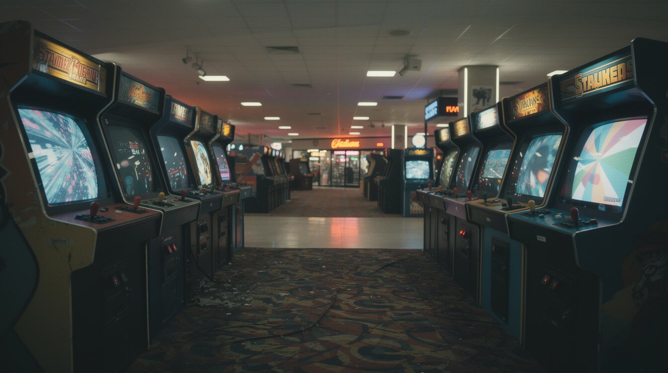
Nobody in your neighborhood held a meeting about it. There was no memo. And yet if you grew up in the 80s, your friend three streets over had the same brass drawer pulls, the same mirrored closet doors, the same checkerboard border running along the ceiling — in a house your family had never once set foot in, decorated by parents who had never spoken. Nostalgic 80s decor gets talked about like a fashion choice people made on purpose. It wasn’t, not really. It was closer to a weather system that moved through every living room in the country within about eighteen months of each other. This is the part nobody explains: where that look actually came from, and why an entire country’s worth of unconnected households landed on the exact same idea at the exact same time.
Nobody in your zip code coordinated with anybody
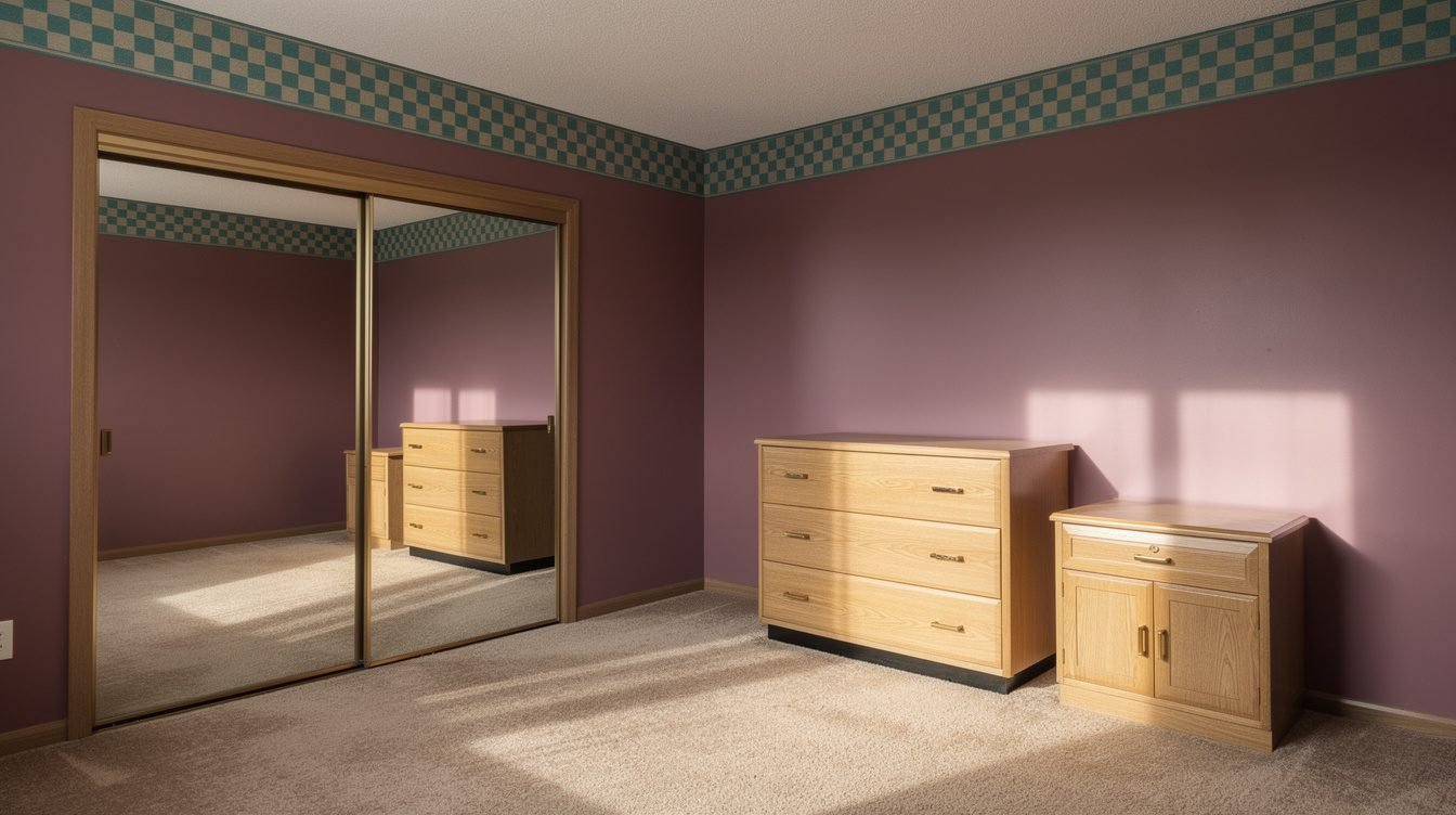
Here’s the part that should be stranger than it feels in hindsight: a kid in a two-bedroom rental and a kid in a five-bedroom colonial could have functionally the same bedroom in 1986. Same palette family — mauve and teal, or black and hot pink, depending on which year you landed in. Same mirror-and-brass logic on the dresser. Same glossy laminate standing in for wood nobody could afford, printed with a grain pattern that didn’t match any tree that has ever grown. Style is supposed to be a signal of taste, income, or at minimum, effort. This one wasn’t. It arrived pre-installed, the way weather arrives — everyone just got the same front moving through at once, whether they lived on the good side of the highway or the other one.
That’s the tell that something bigger than “trend” was happening. Trends are chosen, one household at a time, by people comparing options and picking a favorite. This one was distributed — the same handful of decisions, made somewhere else entirely, handed down to everyone at once with no room to opt out. And once you notice that a look can be distributed rather than chosen, the actual question changes. Not “why did people like brass and neon,” but “who decided, and how did the decision reach every household in the country without a single one of them talking to each other.”It’s worth sitting with how unusual that actually is. Most of what makes a room feel like “your family” is supposed to be the opposite of distributed — inherited furniture, a grandparent’s lamp, whatever the previous tenant left behind and nobody got around to replacing. The 80s bedroom skipped most of that. It was often the first fully coordinated room a family had ever owned outright, new from a catalog instead of handed down, which is part of why it felt like an upgrade at the time even though, structurally, everyone was buying the identical upgrade.
Where the palette actually came from
Start with the decade before, because the 70s palette wasn’t random either. Harvest gold and avocado green weren’t picked because anyone found them beautiful in isolation — they were the earth-tone hangover of an energy crisis and a back-to-land mood, colors that read as sensible and grounded after a run of years that had had enough of excess. Those two shades became the two best-selling refrigerator colors in the entire country, which tells you the palette wasn’t a design movement so much as a national mood ring. Gas lines and Earth Day did more to pick your parents’ kitchen color than any interior designer ever did.
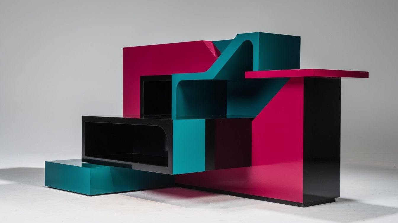
By the turn of the decade, a small design collective in Milan got sick of both things at once — sick of the earthy, sensible 70s palette, and sick of the humorless black-box minimalism that had run modern design for a generation before that. Ettore Sottsass founded the group in December of 1980; the first collection went up at a Milan showroom the following September, all asymmetrical shapes, plastic laminate, and colors that had no business sitting next to each other on purpose. It was named after a Bob Dylan lyric, which tells you everything about how seriously the group intended to take design orthodoxy. It was supposed to be a joke that also happened to be furniture — a shelf unit built to be a little bit funny about being a shelf unit.
Nobody in your childhood bedroom owned an actual piece from that collective. That’s not the point. The point is what happened next: the joke leaked. Mass manufacturers who would never license the real thing, and couldn’t have afforded to if they’d wanted, watched the mood work its way through design magazines and furniture trade shows and started making cheaper, blunter versions of it — the shapes without the philosophy, the colors without the punchline. By the time it reached a furniture showroom two exits off the interstate, it wasn’t postmodern critique anymore. It was just what a nightstand looked like now, sold at a price a Milan design collective never once had to think about.
The catalog made 80s decor a national accident, not a trend
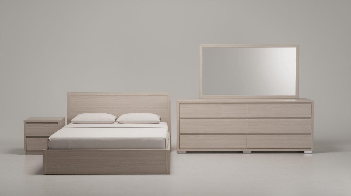
Here’s the actual mechanism, and it’s boring in the way that real explanations usually are: the department-store catalog sold rooms, not pieces. You didn’t pick a bed and then hunt down a dresser that complemented it. You picked “Suite 4” or whatever the catalog called it that season, and the bed, dresser, mirror, and nightstand arrived pre-matched, because matching them yourself was both harder and more expensive than buying the bundle. The catalog wasn’t really selling furniture. It was selling the decision itself — pre-made, bundled, and identical from a house near the highway to a house three states over.
That’s how a Milan art joke ends up in a thousand identical configurations in a thousand unconnected houses that never crossed paths. Nobody downstream of the catalog was expressing anything. They were selecting from a menu with four options, and three of the four options that year happened to involve a mirror and a strip of brass-finish trim. Multiply that by every department store running the same seasonal buying cycle, sourcing from the same small handful of manufacturers, and you don’t get a trend so much as a monoculture — the furniture equivalent of every fast-food chain rolling out the same limited-time flavor because they’re all reading the same trade report at the same time.
The mall’s home-goods store did the same thing to a smaller footprint: lamps, wall art, and the picture-frame sets that showed up in every den regardless of which family lived there. We’ve written before about what the mall itself was actually built to do to a shopping trip — the same “one place decides for everyone” logic applies here at the scale of a single room instead of a whole Saturday.
Brass, mirror, and the affordable-luxury trick
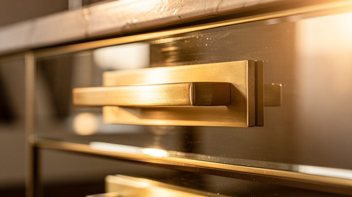
Real brass is expensive and needs polishing. Real mirror in a proper wood frame is a furniture-maker’s job, not a factory line’s. What showed up in a million bedrooms instead was brass-finish hardware stamped onto particleboard, and mirrored closet doors that did the actual heavy lifting: they made a ten-by-twelve room look like it had another ten feet nobody could afford to build. Mirror wasn’t really a design choice so much as a square-footage hack, and once you clock that, the whole aesthetic reads differently — less “everyone loved this look,” more “everyone was solving the same square-footage problem with the same cheap trick, at the same time, without comparing notes.”
Add the laminate — printed to look like marble, or a wood grain that never existed, or nothing recognizable at all, just glossy and confident under a light fixture — and you’ve got the full material logic of the decade: nothing had to actually be the expensive thing it was gesturing at. It just had to look like it, loudly, under enough light that nobody examined it too closely. Glass block did the same job for walls: a whole material category built around “translucent enough to suggest openness, opaque enough that nobody has to actually renovate.” None of it was trying to fool an expert. It only had to fool a family walking through a model home on a Saturday, and it was very good at that one job.
The waterbed belongs in this same category, even though it gets remembered as a novelty rather than a material trick. A waterbed wasn’t cheaper than a regular mattress — often the opposite, once you counted the heater and the frame — but it read as futuristic in a way that made the rest of the room’s fakery feel intentional instead of budget-driven. One genuinely unusual object in the corner did a lot of work convincing you the mirror and the laminate were choices too, and not just what was available at the price point everyone in the neighborhood happened to be shopping at that year.
If you want a version of that logic that still holds up under close inspection instead of falling apart, our shop runs on the same principle in reverse — we’d rather get one honest detail exactly right than fake ten expensive ones.
The geometry did the rest of the work
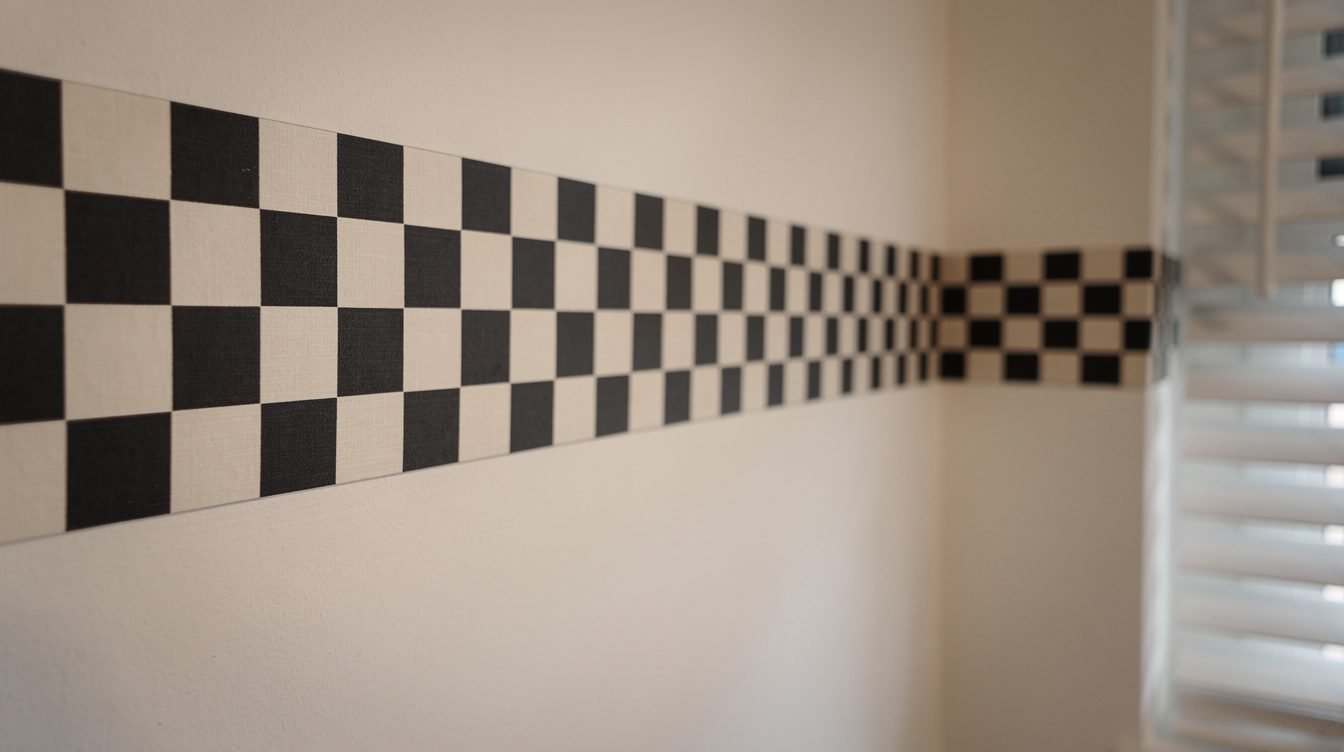
Color gets all the credit in most retellings, but the pattern language did just as much work, and it’s the part that ages the most specifically. Checkerboard borders running along the top of a wall where crown molding would have gone in a house that could afford crown molding. Squiggles and confetti-shapes on bedspreads that matched nothing in nature and weren’t trying to. Mini-blinds instead of curtains, because a hard-edged rectangle was suddenly more correct than a soft fold of fabric. Track lighting aimed at nothing in particular, just to prove the room had more than one light source.
All of it traces back to the same source as the palette: shapes that were sharp, asymmetrical, and a little bit smug about not matching, filtered down from a design joke into a manufacturing spec sheet. A postmodern collective can put a squiggle on a one-off cabinet and mean something specific by it. A wallpaper factory printing the same squiggle onto forty thousand rolls of border trim just means “this is the pattern this year.” The meaning didn’t survive the trip. The shape did, mostly intact, which is the part that’s still recognizable forty years later even to people who couldn’t tell you why.
The room built around a glowing rectangle
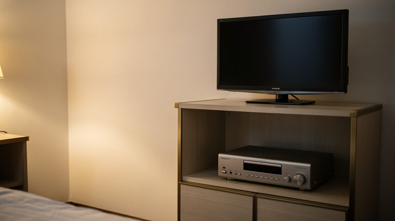
Walk the floor plan of any 80s kid’s bedroom and it becomes obvious what the room was actually built around: not the bed, the shrine. A shelf unit — laminate, obviously, with a strip of that same brass trim along the edge — holding the television at eye level from the bed, the stereo underneath it, the tape deck under that, everything angled slightly inward like a chapel. The rest of the furniture arranged itself around that corner the way furniture in a living room arranges itself around a fireplace. It was the one part of the room that actually got chosen, sightline by sightline, instead of ordered off a catalog page as a bundle.
We’ve written before about why the cassette deck looked the way it did — form following a mechanical constraint instead of a design brief. The shrine shelf is the same logic scaled up to a whole corner of the room: the electronics dictated the furniture, not the other way around. Nobody’s parents sat down and decided the television deserved the best sightline in the house. It just did, by the accumulated weight of every evening spent in front of it, and the furniture eventually caught up to that fact, brass trim and all.
You can still map the room from memory if you had one: the cord that ran along the baseboard because nobody thought to plan an outlet near the shelf. The specific angle you had to prop the antenna at to kill the static on channel nine. The volume knob that only worked right if you turned it past the click and back. None of that made it into the catalog photo. The catalog sold you the shelf unit. It never once tried to sell you the ritual that happened in front of it, because the ritual wasn’t a product — it was just what happened once the furniture and the evening lined up.
You already own three of these. Here’s a fourth.
Designs made by people who were actually in that room, for people who remember exactly which corner the shelf unit was in.
Quick answers about nostalgic 80s decor
Was 80s decor actually planned by designers, or did it just happen?
Both, at a distance. A small postmodern design collective in Milan set the mood in 1981 as a reaction against the previous decade’s earth tones and the era before that’s minimalism. Mass manufacturers borrowed the shapes and colors — not the philosophy — and department-store catalogs turned the borrowed look into pre-matched furniture sets sold as a single bundled decision. By the time it reached most bedrooms, it was three or four translations removed from anyone’s original intent, which is also why almost nobody who lived in it can name where it came from.
Why does so much of it involve mirrors and brass?
Mostly economics dressed up as style. Mirror made small rooms read bigger for the price of a sheet of glass. Brass-finish hardware signaled expense on particleboard furniture that was anything but expensive. Both were cheap, fast ways to gesture at a level of luxury nobody in the house was actually paying for, and both worked well enough that nobody questioned it at the time.
Why does mini-blinds-and-checkerboard read as “80s” more than the color palette does?
Because pattern survives translation better than intent does. A color can be reused sincerely forever. A very specific geometric border or a hard-edged blind slat reads as a period the second you see it, because nothing before or after quite repeated that particular shape at that particular scale. Palette dates a room. Geometry dates a decade.
Is it back because people genuinely love it, or just because nostalgia cycles?
Probably some of both, but the cycle argument only explains timing, not appeal. The actual pull is that it’s one of the last mainstream decor eras that wasn’t algorithmically optimized for a photo feed — it was optimized for a catalog page and a showroom floor, which is a slower, different kind of designed, and it shows.
Final thoughts
None of this makes the look sacred. Half of it was a cost-cutting trick and the other half was a joke from Milan that got lost in translation four times over before it reached a shelf unit in a rental bedroom two exits off the interstate. That’s a different story than the one told by the decor aisle at a gift shop, which sells the palette back to you with no idea where any of it came from or why. But knowing the mechanism doesn’t kill the feeling — if anything it explains why the look still reads as right to the people who had it, and as costume to everyone else buying the colors off a moodboard: you’re not remembering a design decision. You’re remembering the room the decision landed in by accident, which is a completely different thing to be nostalgic for.
One good link a week. No fake hype.
Reply and tell us your era. We read those.